Home Decor Paint Colors

I worked in a paint store from 2008-2009, part time to supplement my income as a personal trainer/fitness instructor. I really became very fascinated with colors by working there. I had already worked in decorating events and wedding color coordination so had some ideas of what colors blended well together. I learned to mix hues to create new colors and how to choose paint colors for indoors and outdoors.
Even though the fitness industry is a multi-billion dollar industry it doesn't pay well in my country. Most of my work was done with minimum pay. I worked for an organization that was almost non profit. They turned no one away and most of these people could not pay. So I had to supplement my income by doing part time or private jobs which led me to the paint store.
Before you read any further I want to apologize for the limited colors samples displayed as my graphic software is not very capable of showing rich colors.
Color meanings
- Red is associated with danger, excitement, passion, war, love. Not a relaxing color, not suitable for bedrooms
- Pink is a feminine color and denotes love, sensuality and romance. Can be used with moderation. Baby pink and light hues are okay for bedrooms.
- Orange has yellow mixed in so gives off energy and a bright sunny nature. Very suitable for living rooms.
- Green is the most natural color in nature. It is associated with growth, fertility and harmony. It promotes happiness and is suitable for any room in the house including sleeping quarters.
- Yellow is a bright sunny color which symbolizes the energy associated with the sun. It energizes and promotes happiness, mental clarity and intelligence. Someone waking up to a yellow bedroom will be a well balance individual. Suitable for any room in the house.
- Blue is associated with water such as the sky and sea. It relaxes and promotes a good night's sleep. Everything good is associated with the color blue such as wisdom, spiritual happiness, intelligence, faith and trust. The most suitable for bedrooms but will also do for any room in the house. Also a masculine color usually associated with boys.
- Black is the color of darkness. Should never be used by itself and can only be truly balanced with white. Black symbolizes, death, evil, power, strength and arrogance. Not suitable for any room unless used in conjunction with yellow or white. Must not be the primary color in the room. Do not use in bedrooms.
- White signifies purity, perfection, innocence and virginity. Suitable for any room in the house.
Tips on choosing paint colors
Years ago white and white tints or whites with a hint of color were the norm. People were afraid to go bold. Over the last decade or so people have been going all out with colors in their homes. Wall paints are no longer dull and boring and every room has its own unique look.
Here are some things to remember when choosing your paint colors
- Choose colors that you like. If you don't like the color you are more likely to change it so don't let any one influence you to choose something you are not happy with.
- Colors should be chosen that are compatible with change in linen, drapes, curtains, furniture - at least for over a one year period. Makes no sense painting every three months.
- Choose your color based on the decor you intend to use. So if you intend to use three different curtain shades thoughout the year, your color should complement those shades
- Think about the space and choose a color that will enhance the space rather than hide it. For example a nook you intend to use as a play area for the kids. You wouldn't use navy blue there unless it's different shades of blue. Bright sunny colors would work best or wall patterns such as undersea treasures, a forest, fairyland or some favorite cartoon characters. If using a solid color then a bright sunny color such as yellow.
- See whether or not the space is well lit or dark and choose your color appropriately. Dark spaces need bright colors such as whites where the light can reflect off the pigments to make it light up. Well lit spaces may become too bright if you choose whites so tone down the color a bit for well lit spaces.
- Bedroom colors should be earthy or cave like. Relaxing colors will enhance sleep. See color meanings.
- Paper samples and the computer don't give 100% accurate presentation of the color you want so you must go to a paint store to see the actual color before purchasing.

Tips on applying paint
Painting for the first time
- If painting your wall for the first time (virgin walls), make sure there is no dust or grime on the wall. Sometimes wall finishes can be a bit grainy or course so you may need to sand the wall.
- You will need a primer. If it's outdoors you will need an anti-fungal primer. This will keep your wall free of fungus due to moisture.
- You may need two coats of primer and two coats of paint
Changing paint color
- Changing from a dark to light color may require more than two coats of paint so to be safe use a primer on the old dark paint first.
- If primer is unavailable use a thick coat of grey (to simulate the virgin wall) and two coats of your color.
- Changing from light to dark color is easy, just apply several coats.
Changing paint type
- If changing from an oil to water based paint on the same wall you will need to use a paint remover and erase the oil based paint. If you don't then in a few days, weeks or months the paint will peel. Water does not adhere to oil.
- You can paint oil over water without causing problems.
Where to paint first
- Paint all ceiling beds first
- Leave skirtings or moldings for last
- Apply your first wall coat then paint corners then finish with your second wall coat


Color Themes
If you are painting your entire home you may want to stick with a theme. Choose your favorite color than choose colors that complement, enhance or blend well with that color. There are different styles:
- Flowing colors off the same pallet such as different shades of green with hues of blue or yellow see photo
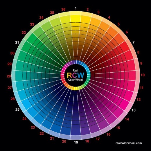
- Complementing colors. These don't have to come off the same pallet but will be opposite on the color wheel. Example, shade 1 and 19 on the color wheel above complement each other and blend well.
To know if colors work well together, your should see a sample on a wall with both colors side to side. If they look great together then you have a winner. If they clash then try something else.
Complementing colors will work great in the same room.
When you color your home you should get an effect when you walk through each room. The colors should be so connected, even if on the opposite side of the scale.
Gallery
Click thumbnail to view full-size


Styles of Painting
- Plain: Some people prefer the plain old one color per room. Some even like the same color and shade right throughout the house.
- Two tone same pallet: There is the two tone room where you have the same color pallet at work with two different shades. Use the darker shade on the wall you want to highlight the most or the wall that you see first when you step into the room. The lighter shades cover the other walls
- Two tones different color, opposite walls: here is the two tone rooms. Two separate colors with one very light and pastel like and the other deep. Use the deep color on the wall you will see first as you enter the room.
- Two tone stripes, either using the same color pallet with different shades or two separate colors
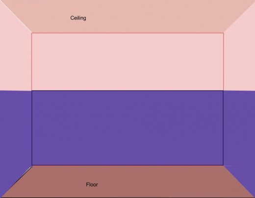
- Two tone half and half: Top half with a light color and the bottom half in a darker color. Can be two opposite colors or from the same pallet.
- Murals can be done if you like that sort of thing. Goes well with play rooms and kids rooms. One wall in a living room not so bad either.
- Sponging: Gives a great finish to walls. This is done using special sponges designed for this purpose but you can use regular sponge. You can sponge on almost any color. Use a contrasting color to create uneven patterns.
- Wash: This is the most simple and cost effective beautiful technique in painting. Have a wall you need to give a new look? Buy a pint of paint and water it down a bit. Use a soft rag and dab all over wall. Do this until you get the look of a new wall. See photo.
- Stencil is creating patterns on the wall using cutouts. You don't have to get expensive stencil material, you can use paper.
Are you sleeping well?
Is your bedroom in one of the recommended colors?
Room and wall color recommendations
- Outdoors should be painted in low sheen or flat, light pastel shades such as off white, tinted whites, light shades of brown, light shades of greens and blues. Low sheen paints will help to reduce fungus build-up and last longer. Flat paint strips and washes away easily.
- Bedrooms should be painted in relaxing colors such as blues, greens, lavenders and peaches. Secondary choices include soft pinks and yellows. Cave-like colors such as deep browns, coffee and deep olive will give a sense of enclosure for those who love to hibernate. Insomniacs do well in such rooms.
- Living rooms can be painted in bright or deep hues, but you must have soft furnishing to soften the look and feel.
- Kitchens go well in mustard, olive, chocolate, coffee and blue.
- Your dining room should be somewhat complemented by the kitchen so a similar or complementing shade will suffice. A good idea would be a softer shade of the same color which is in the kitchen.
- Halls, passages and walkways need light sunny or white colors. Colors that will reflect light. such as white and hints of greens or yellow. **By hints I mean tinted whites using a touch of these colors.
- Bathrooms can be any color you choose so long as your furnishing will complement it. I once painted my bathroom in red and Ahoy blue (a deep sea like blue). It was amazing.
- Porches and verandas need earthy or bright tones that will complement your natural plants. Most people have their garden near their porches and plants on the porches as well. Light shades of yellow, soft orange, greens, blues, beige will do. Do not paint your porch in black or deep reds, your plants will not survive these colors.
")


